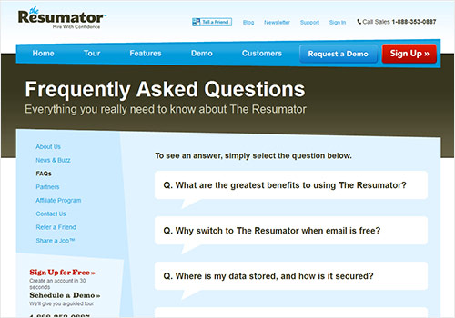
Every company you ever speak to is somewhere in the process of redoing something about their website, and usually doing it mostly wrong — i.e. focusing on bells and whistles, and/or “something they saw on a comparison site,” as opposed to the actual cornerstones of “good user experience.” (Look, if your website is impossible or impossibly hard to use, people won’t come back to it unless they absolutely must come back to it. It’s that simple.)
A lot of redesigns can get caught up in very specific issues, usually related to the key stakeholders. These typically include the home page architecture (makes sense), the navigation menus (ditto), font/image sizes, and things such as those. I’ve been a part of 6-10 of these at various companies (some huge, billion-dollar companies) and here’s one thing I’ve never heard mentioned at any type of high level on a redesign: the FAQ/contact pages. Most people view those as an afterthought, if anything.
Maybe they shouldn’t.
Check this out, from Forrester:
In fact, for the first time in the history of our survey, respondents reported using the FAQ pages on a company’s website more often than speaking with an agent over the phone. Self-service gives you that “pain-free” experience that consumers want. Customers escalate the harder questions to a live agent – whether its chat, email or a phone agent – and these calls become opportunities to help build stronger relationships with your customers to garner their long-term loyalty.
They’ve been doing the survey for a little bit now, and it was the first time that FAQ pages started rising over “actually getting someone on the phone.” That’s pretty notable.
Here’s the rub on this whole topic: a FAQ page is a perfect example of how businesses are often run poorly in terms of actually thinking about things. It’s not flashy or sexy and probably won’t get a lot of eyeballs, right? So internally, people ignore it. But as people become more comfortable with the general architecture of websites, consumers/customers/clients/whatever you want to call them navigate there and expect to find information. So if you’re ignoring it because it’s not a “top-of-mind” page, you’re missing the boat majorly — because it’s a place your customers are, and it’s a place where, if you do it wrong, it can anger your customers.
You see what I’m saying?
Or are you just thinking of “FAH Q?”
Businesses love to chase the shiny object or do what the new flashy thing is (for websites right now, this would be “long vertical scroll with spiffy icons identifying your key target market areas”). But oftentimes in successful business, the fundamentals are more important than what’s out in front. A good user experience involves a good FAQ page, because it’s a major touchpoint where you could lose/anger a customer.
I’ve written a few FAQ pages, and I wouldn’t say I’m great at them, but here’s a few pointers:
- Keep It Simple, Stupid
- I’d go bold question and regular typeface answer. People are used to that.
- Put phone numbers and e-mails in different places if people want to use those methods of reaching out.
- Talk to some consumers before you even start writing the page; think of the questions they might have or be asking.
- Try to remove yourself as much as possible from your internal corporate brain before you write this thing; stuff that’s obvious to you because you live in it day-to-day isn’t obvious at all to the potential reader.
- Keep it short. Attention spans are dead/dying.
- Use basic language.
- Be transparent.
- Make the text and font sizes easy to read.
- Run analytics on it weekly to see how many people are visiting it, how many people are bouncing, etc. If a lot of people are coming but all leaving, that’s probably not the best sign. (Unless you have a lot of phone numbers on the FAQ page and they’re clearly heading there.)
Just my two cents. Could be wrong. Hopefully is mostly accurate. If you’ve got any good context on FAQ page architecture, definitely drop a line or leave something in the comments.
