A “95-20 ratio” compares the income of the top five percent of a city (the rich, essentially) with the bottom 20 percent (the poor, essentially) across the 50 largest U.S. cities. If the ratio is very high, that means the rich make a ton more than the poor. While that’s true in most cities (especially economic centers), a major number on “95-20 ratio” would imply that, uh, inequality is pretty bad in U.S. cities. For example, 2013, Atlanta’s “95-20 ratio” was 19.2; the top five percent make about 20x what the bottom 20 percent do. You can have a lot of different views on inequality — such as the common (for many) “If you just worked harder, you’d make more money!” — but a 19.2 “95-20 ratio” is probably not that great however you slice it.
So … we know cities where the poor and rich tend to cluster together the most, but what cities have the worst (and best) “95-20” ratios?
Here’s the main post on all this, with data from here. Here’s the key chart:
Look at the highest first: SF, Boston, Miami, DC, NYC, Chicago, Los Angeles = not surprises. I would say Dallas and Minneapolis = surprises. In general, coastal and NE cities are more expensive, and that could force people away from them. I’ve lived in both Minneapolis and Dallas (although haven’t been top 5 or bottom 20 percent in either city), and they’re both fairly affordable — although Dallas has very rich people (the 5) and very poor people (the 20), so I could see why it’s listed here. That said, Dallas is a place people are generally moving to (including myself); so is Minneapolis.
Now look at the lowest: a lot of “Sun Belt,” and of course, one city in Ohio. Virginia Beach has been noted for its lack of inequality before; Colorado Springs is also noted for being a good place for singles. (Low inequality and high singledom! Go get it!) I’m stunned Vegas is on that side of the list, because if you’ve ever seen the low parts of Vegas — and then seen the rich people of Vegas — that seems like a staggering gap.
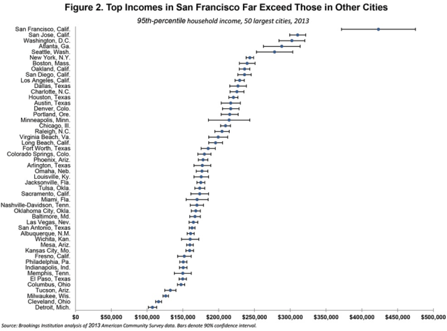
If anyone ever asks you “Hey, where do the rich get richer?” (or if those are the kinds of cocktail party discussions you have), show them this chart:
That’s cool that the top five percent in Cleveland are making $116K nowadays, even though it’s about half of what you’d make in Seattle in the same type of contextual role. Also interesting that Jacksonville has seen an increase in the top five percent — so its rich are getting richer — and its bottom 20 percent — so its poor are getting somewhat richer too. Also cool how San Francisco is No. 2 for bottom 20 percent income growth, but then again…
Look at the top incomes in San Francisco. They’re literally off this fucking chart.
If you look at this chart, it’s basically the 50 biggest cities in the U.S. and how much people in the top five percent are making, on a relative continuum. Interesting that SF and Detroit are 1 and 50 here; those cities are inexplicably linked as once-and-future-and-once-again economic centers.
The first city with a high top-five percent income that isn’t I-95 corridor or a coastal city is Dallas; then there’s a bunch more cities in Texas, kinda underscoring the growth you see there.
Broader lesson here: you can slice city and economic data 9.8 million ways if you want, and ultimately all that matters for where you live is what you think might be best for your family at that time. But there are no doubt 2-3 different Americas within the same geographic shell, especially in terms of how far your money might go and how big the inequality gap truly is.


Not to mention that the US is the most unequal nation in the “developed world”. Very interesting statistics, thanks for sharing!