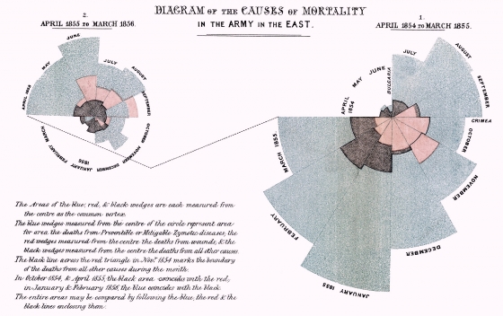
That right there is a data visualization Florence Nightingale did over 100 years ago; I found it in this post from Kellogg (Northwestern), which is an awesome article about visualizing data.
I won’t go super deep into this — you should read the article at the link if this stuff interests you — but consider this idea, right?
- We spend tons of time teaching people about business etiquette and process.
- We spend almost no time talking about how to effectively present information to a group of people.
- We spend tons of time talking about the coming revolution of “Big Data.”
- We spend almost no time training people on how to make people understand that.
Most CEOs would rush in and say “Well, hire more data scientists!” OK. That’s one part of the problem, sure. You need people that can actually break down information and run it and not have errors.
Here’s the thing: a lot of data scientists can be nerds, or introverts, or less-than-charismatic speakers and e-mailers. And if they’re hardcore, they really value the data. They assume everyone else does at that level, too. (We all know people like this.)
Here’s a truer, harsher reality of life: very few people give a shit about anything except their core job and responsibilities when it comes to work.
And here’s another one: very few people can process data, especially large reams of data, in any type of logical way.
So yes, you need to hire data scientists. That’s true. You also need to hire people who can take findings and effectively communicate about them. That actually might be more important.
I mean, the whole goal of any presentation at work is to get people to buy into an idea, right? Or a concept? Or understand where/why/how something is happening? So you need to reach people where they are. That’s actually much harder than you think.
A lot of people assume hierarchy solves this problem — i.e. you have to listen to something that someone up the chain is saying. That’s true to an extent. It’s not the entire picture.
Look at this thing:
That’s from The New York Times. Pretty vetted brand name, right?
If you saw this in a presentation and had someone who isn’t a good presenter or explainer walking you through it, you’d get lost in a second.
If you saw this and the person talking really knew how to explain/convey the idea, you’d get it — and you’d probably get it even if you don’t care, because it’s interesting and new, and our brain likes stuff like that.
Now let’s say you see this:
You probably have no idea what the hell is going on. But if the person presenting really gets it and loves the concept and loves how he/she designed it, he/she might just talk right through all the confusion. You know what happens then? Everyone is checked out. The presentation is pointless.
Phrased another way:
“Nobody ever gets taught these rules. You take writing classes in college. You don’t take a graphical communication class,” he says. Yet, “this is a skill that people need to have. If you learn these rules, it will have a multiplicative impact on how well you can convey your ideas to people and how well those ideas will actually sink in and then lead to action.”
The literal only reason to give a presentation at work is to convey an idea that will ultimately be tied back to some form of action. So if you’re not conveying the idea and/or not tying it back to action, well … what’s the point? (A: There is none.)
Now think about this for a second. How do most people give presentations? They use PowerPoint or something similar, right? Hmm. OK. Now read this:
Because our brains use the same systems to process speech and written language, putting up text on a screen while talking “ensures that you won’t get your point across, because no one can read and listen at the same time” he says.
LOL.
Think about that.
The standard way we’ve been presenting ideas and concepts for decades involves text on a screen + talking. That doesn’t even work. Nice.
So yes, there’s an issue here with analysis vs. synthesis, right? And there’s an issue with understanding your audience, true. Those are both at play.
But at core: you’re presenting about an idea or some type of end-goal action. You need to make people understand it, understand how it fits into the company as a whole, and want to do something about it. We’re all visual creatures.
You can do that — and somewhat easily — with visuals. But … you need to have the right people to concoct and explain them.
A normal human brain, and a normal rank-and-file worker, can’t understand what “Big Data” is or what it means for them. But if you use the right images and have the right people explaining them, they might be able to. And that’s a start, right?
Now, about those human biases…


Amen. I have a bachelor’s degree in communication because I didn’t know what I wanted to do with my life. I eventual found my career in Management Accounting. Over and over again I interact with people that don’t realize how important how to communicate a message is. That bachelor’s degree serves me much more often than my Master’s Degree in Accounting does. Managerial Accounting is effectively analytical problem solving which comes fairly naturally to me.
I wish I knew what came naturally to me.
I sum up Big Data by describing it as a series of filtered lists, except on a larger scale. So, instead of filtering, say, 3 or 4 columns in Excel, we’re filtering hundreds of columns of variables and millions or billions of rows of data.