This topic has been coming up a lot recently. Harvard Business Review had a whole article on it — with studies! — a few days ago, and here’s a profile of Facebook’s former design chief joining WealthFront as a VP of design.
Think about this, as a two-step process:
- We often get a lot of things wrong about retirement / don’t think about it.
- Good design/UX/interface is pretty much the single most-important thing in terms of having a product people want to deal with/buy.
So if we want to make people focus on and care more about their retirement planning, shouldn’t we be applying better design and UX principles to it?
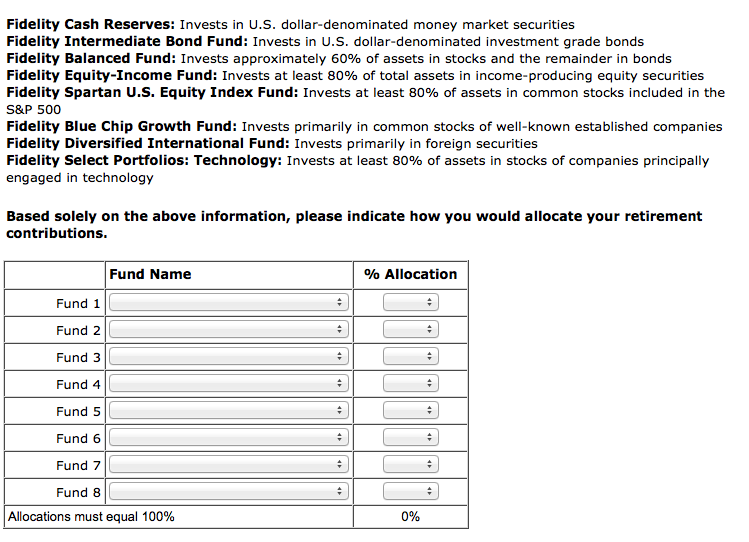
For example, here’s a really small/trifling thing that can make a big difference. Look at this:
Now look at this:
It’s pretty much the same, except the second option allows you to choose eight funds; the first option allows you to choose 4.
Here’s what they found based off that, via HBR:
This probably seems like a trivial design change. Nevertheless, Thaler and I found that the precise number of lines on a website dramatically impacted the level of diversification of Morningstar subscribers. While only 10% of people shown four lines selected more than four funds, that number quadrupled among subjects given eight lines. This means that the level of diversification was driven, in large part, by a seemingly minor website specification, almost certainly chosen by someone with little investing expertise.
So essentially …. you make a small design change and the diversification level of funds changes, which can make your retirement more effective.
We’ve thought of these things as financial and advising issues for so many years, right? But humans are visual creatures and maybe this is, at core, something we need to consider as a design issue.


